I used an iframe on a recent project to embed a postcard builder inside the client’s Webflow site. I wanted to share how you can use iframes in your project, show you a few examples, and discuss the limitations of iframes.
What is an iframe?
Maybe you’ve come across iframes in the past, but let’s take it from the top and explain what exactly an iframe is.
An inline frame, a.k.a. iframe, is an HTML element that lets you embed another HTML document within the current one. You can use it to display websites or media from a different source on your webpage.
How to embed an iframe in your Webflow site
Embedding an iframe in Webflow is super easy. Let’s go through it step by step.
Step 1: Add Embed element
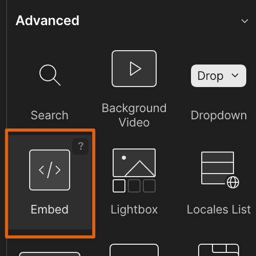
Drag an Embed element into your structure. Note that you can only use the Embed element if you are on a paid site plan.

Step 2: Add custom code
Add the following custom code:
<iframe width="1024" height="768" src="<https://www.website.com>"></iframe>
You can configure a few things here. First, replace the URL in src=”” with the website you’d like to embed. Second, you can use the iframe width and height to fit your design.
Note that the Webflow custom code is viewport agnostic. This means that if you change the width or height of your iframe in the custom code, it will change in all viewports, so it won’t be responsive. Fortunately, there are solutions to this as well.
Responsive iframes
Making iframes responsive can be a bit of a challenge. Let’s first get one thing out of the way - for an iframe to be responsive, the content that’s being embedded inside of your iframe must be responsive. Obvious, but I wanted to mention this.
It’s easy to have the width of your iframe adjust to the screen width. Just set the size to 100%. However, having the height adjust accordingly is not easy.
There are two solutions to manipulate the height of your iframe responsively.
Giving you iframe a special class
The first one achieves this by creating a dummy div and giving it a custom height at each breakpoint.
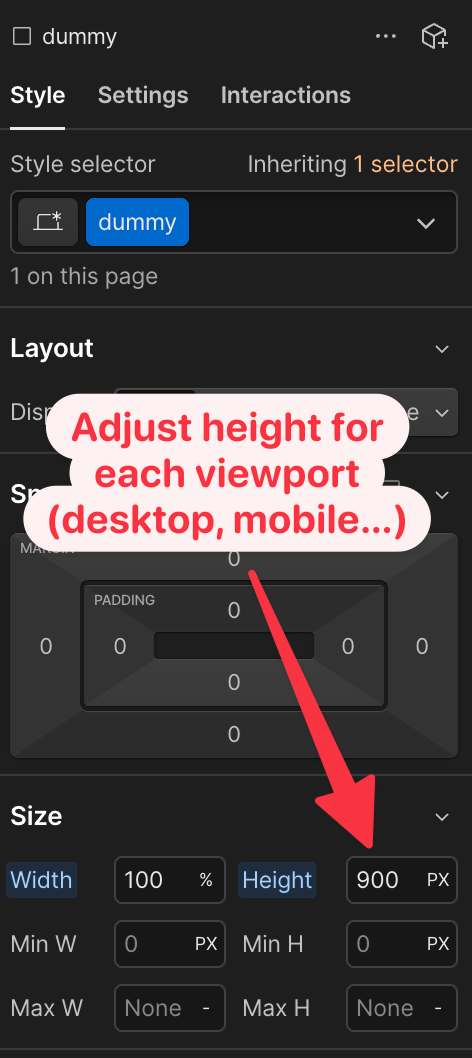
Create a div anywhere on your page (we will delete it at the end). Give it a class. I’ve named mine “dummy”.

Now give the same class name to your iframe by changing the custom code to this:
<iframe class="dummy" src="<https://www.website.com>"></iframe>
Give your dummy class a width of 100% and adjust the height in PX (or REM/EM etc.) so it looks good on each breakpoint. When you are happy, delete your dummy div, and voila.
Using Pym.js
A more elegant solution is to use the wonderful Pym.js library. This code automatically resizes the width and height of your iframe based on the viewport size.
There’s a detailed how-to on the Pym.js website.
Your Webflow page inside of an iframe
You can also embed your own Webflow page inside of an iframe. This is useful if you have several projects and want to cross-post content, or if you want to allow others to iframe your website.
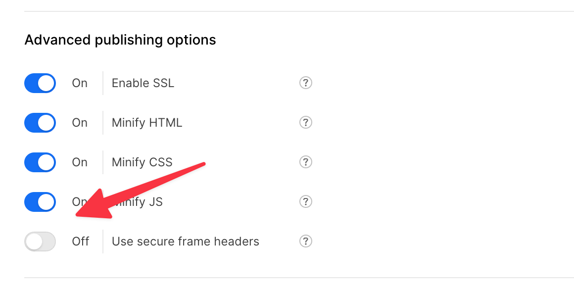
Before you iframe your page, ensure the “Use secure frame headers” in Site settings is turned off. To check, go to Site settings → Publishing → Advanced publishing options at the bottom of the screen and uncheck “Use secure frame headers”.

Conclusion
There you have it, adding an iframe to your Webflow site is very easy. Getting it to behave responsively is a bit more tricky, but nothing impossible.
Hope you enjoyed this tutorial. If you have any questions, DM me on X.
